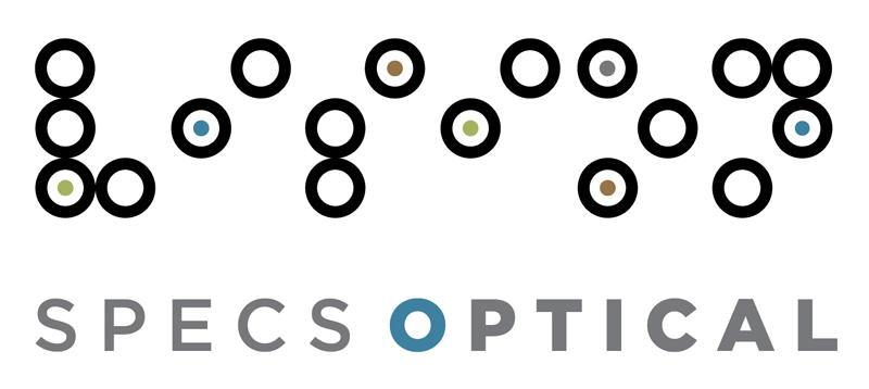
We wanted the Specs Optical identity system to reflect their fresh and modern outlook as well as the exciting new redesign of the shop’s facade and interior. Inspired by eyeglass frames as well as the interior of the shop itself, we created Specs-specific alphabet of black rings that can be used to spell various words like “vision” and “hello.” The random interior dots represent eye colors. The linear pattern was inspired by prisms and the patterns of reflection and refraction. All of the pieces work together to reinforce the personal and individual service that is so much a part of the shop.
We also just found out yesterday that the ID system is going to be included in Print magazine’s 2009 Regional Design Annual–yay! So you could mention that as well, if you like.

Like the new look of our logo? So do we. The design duo behind it are graphic designers, Sharon Werner and Sarah Nelson Forss, of Werner Design Werks in Saint Paul. We asked Sarah to clue us in to their thoughts behind the design:
“We wanted the SPECS OPTICAL identity system to reflect their fresh and modern outlook as well as the exciting new redesign of the shop’s facade and interior. Inspired by eyeglass frames as well as the interior of the shop itself, we created Specs-specific alphabet of black rings that can be used to spell various words like ‘vision’ and ‘hello.’ The random interior dots represent eye colors. The linear pattern was inspired by prisms and the patterns of reflection and refraction. All of the pieces work together to reinforce the personal and individual service that is so much a part of the shop. We just found out that Specs’ ID system is going to be included in Print magazine’s 2009 Regional Design Annual.”

